 NASA's page on global climate change has some pretty interesting up-to-date information on world carbon dioxide levels. The charts on this page are used to show direct measurements taken between 2005 and September 2014, indicating that carbon dioxide levels have been steadily increasing. Another chart features indirect CO2 measurements from ice cores, showing fluctuations in carbon dioxide levels as far back as 400,000 years, with a drastic increase starting around 1950. I found these charts to be very easy to read and gave me pertinent information about how carbon dioxide levels have been changing over the years.
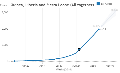
The Huffington Post shared an article about the recent Ebola outbreak, including interactive charts containing the number of outbreaks in the countries with the highest number of cases (Guinea, Liberia, and Sierra Leone) as of mid-October. A second line on each chart plots a forecast for future cases if current conditions persist. In terms of wanting to know specifics about how many cases have been reported in these countries I found this article quite helpful, but while interesting, the predictions must be taken with a grain of salt as accurate forecasting is a difficult task.
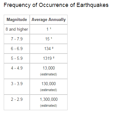
 The US Geological Survey has a great page featuring their Earthquake Hazards Program, riddled with data tables on world earthquake statistics. These tables include information regarding earthquake magnitude, frequency, and location. Other pages related to the program provide graphs and other graphics related to such data, providing the public with up to date worldwide earthquake information. I liked this website as it provided simple and informative visual information about the research USGS has been conducting over the years.
No comments:
Post a Comment